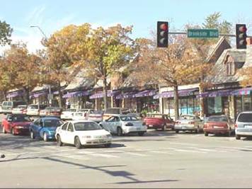
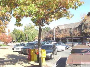
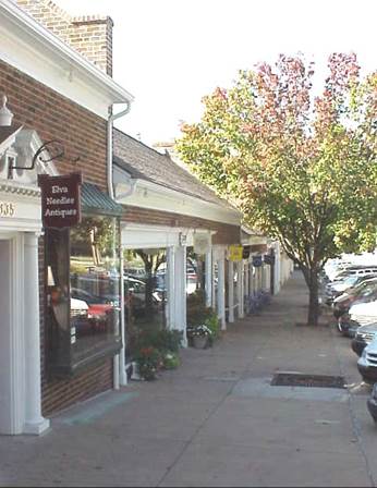
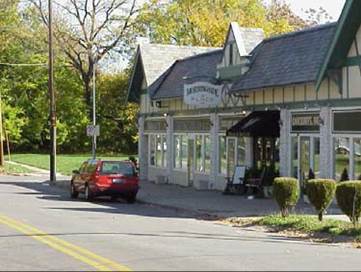
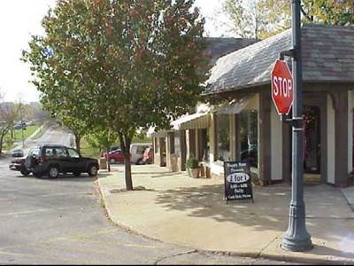
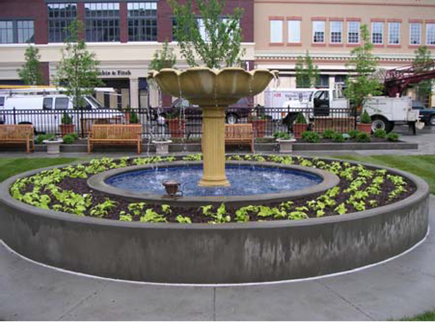
Centers are strategic and concentrated activity centers, located in the middle of the generally radial surrounding area which it supports. Centers are typically located at the intersection of two streets classified as collector or arterial. Within a Center, patterns are more compact and integrated, with multiple connections to surrounding areas in all directions. They provide efficient dispersion of traffic through short, well-defined blocks. It is highly pedestrian oriented. Through traffic is not a priority, and it either moves more slowly through the Center or makes use of alternate connections to other destinations. Ground floor uses are retail or other uses that generate high pedestrian traffic, while upper level uses may be office or residential. Centers make more efficient use of public investment in infrastructure and private investment in buildings and site design elements.
|
Streetscapes: Streets should not only
be designed to get people
someplace but also be designed to be “someplace,” balancing the needs
of multiple users of the public rights-of-way. The streetscape is the “destination” in a center. |
|
|
! Use expanded
landscape areas
to transition from
the on-street
parking to the pedestrian zone. Amenities such as landscape beds, tree wells, benches
or other street furniture should be regularly spaced in a 4 to 6 foot wide area, interspaced with an expanded pedestrian area. ! Expanded sidewalks, where significant areas for through pedestrian traffic remain, may create
areas for street
activities
related to uses in the buildings, such as sidewalk
sales, outside dining or seating
areas, and kiosks. ! Street trees should be densely located
to provide shade for pedestrians, yet achieve canopy heights and crown
heights that maintain visibility of adjacent buildings and the street
level uses. ! Frequent connections to adjacent Neighborhoods should provide multiple alternative routes between the Neighborhood and the Center. However the design
of these connections should discourage through traffic which does not originate in the Neighborhood. ! Curb-cuts should be limited
in width, frequency, and location. Vehicular access to sites should not occur on any primary street, but be located on secondary streets or alleys. Access points should be
combined and
shared within blocks. Curb-cuts should always be designed to emphasize the priority of
pedestrian
movements along the streetscape. ! Intersections should appropriately balance vehicle
turning movements and pedestrian movements. Techniques to slow turning movements and
decrease pedestrian crossing distances, such as bump-outs or curb-projections, smaller curb radii, and pedestrian refuge items should be incorporated into the streetscape. |
|
|
Buildings: Buildings should have a uniform
setback with no visual obstructions for adjacent buildings. |
|
|
! All buildings shall
have its primary façade and primary entrance oriented towards the street. ! Metal siding shall not
be allowed as the
primary building material for building facades visible from the right-of-way ! Street level facades should include significant proportions of transparent display windows. Generally, between 60%
and 90% of
all street-level facades between 2 and 10
feet above
grade shall be transparent with views
to the interior of the building. No window starting at
a level of
greater than 3.5
feet above the street level
should be included in the calculation. ! Upper level
facades should include punched openings with transparent windows. Openings should occupy between 25% and 60% of the upper
facades. Each
story should meet
this requirement independently. ! No more than 30
feet of horizontal blank wall
space should be permitting along
street level
facades without a display window or building entrance. ! Significant deviations from building alignments may occur
along the street wall at limited locations along
a block face. These deviations should be
strategically located to emphasize and embellish important elements of
the public realm
– the streetscape design and
include features such as
public art and water fountains. Examples of
significant deviations in
the street wall are front entry courts for dining
or building entrances, courtyards or plazas, or upper
level patios. ! All facades shall include architectural elements such as
accent banding, base
plates, cornices, soffits, sills, parapets, transoms, and windows aligned horizontally. The horizontal alignment
should differentiate stories in
a building and
create a
base and crown for the building. The
base should be between 5%
and 25% of
the building height, and the crown should be
between
5% and
15% of the building height. ! Architectural diversity and creativity should be encouraged and rewarded to avoid dull
or homogeneous buildings. Buildings should incorporate elements from the vernacular of
buildings in Maize and Central
Kansas. |
|
|
Sites: Sites should be designed
to
emphasize buildings and
their relationship
to the streetscape, rather than individual lots along a block. |
|
|
! Primary access to most
individual sites shall be
pedestrian
oriented, with vehicle access concentrated at shared entrances, provided internal to the blocks, or central parking facilities or
on-street parking. ! When located on the side or in
front of buildings, parking areas shall be
screened in
accordance with landscape ordinance. ! High-impact site elements, stormwater facilities, storage
areas, or
loading areas and
shall be limited or
located and designed to minimize impact on the streetscape design. ! Exterior lighting and signs
shall be provided and
should coordinate with building architecture and landscape materials and in accordance with sign code. ! Use screens and
buffers only when a better site design that relates to adjacent sites, buildings, and
uses is not possible. |
|
|
Open Spaces: Open spaces
are valuable for their ability to enhance public
life in Centers, providing
patrons of businesses opportunities for gathering and
social interaction. |
|
|
! Plazas or courtyards should be located at key focal points along the streetscape with high
accessibility and visibility, and
be consolidated within
blocks. ! Open spaces should be
designed to provide a balance of “hardscape” for public gathering and
“landscape” for ornamental purposes. ! Open spaces should include elements of public
art. ! Any green
space in the Center
should be designed to serve multiple functions of stormwater mitigation, recreation, aesthetic amenities, or strategic screening. Undevelopable
remnant green
space is not valuable to Centers. ! Incorporate sensitive natural areas or prominent topographic features into natural open
space features. |
|
